The Piaget Polo 79 Changes Its Stripes
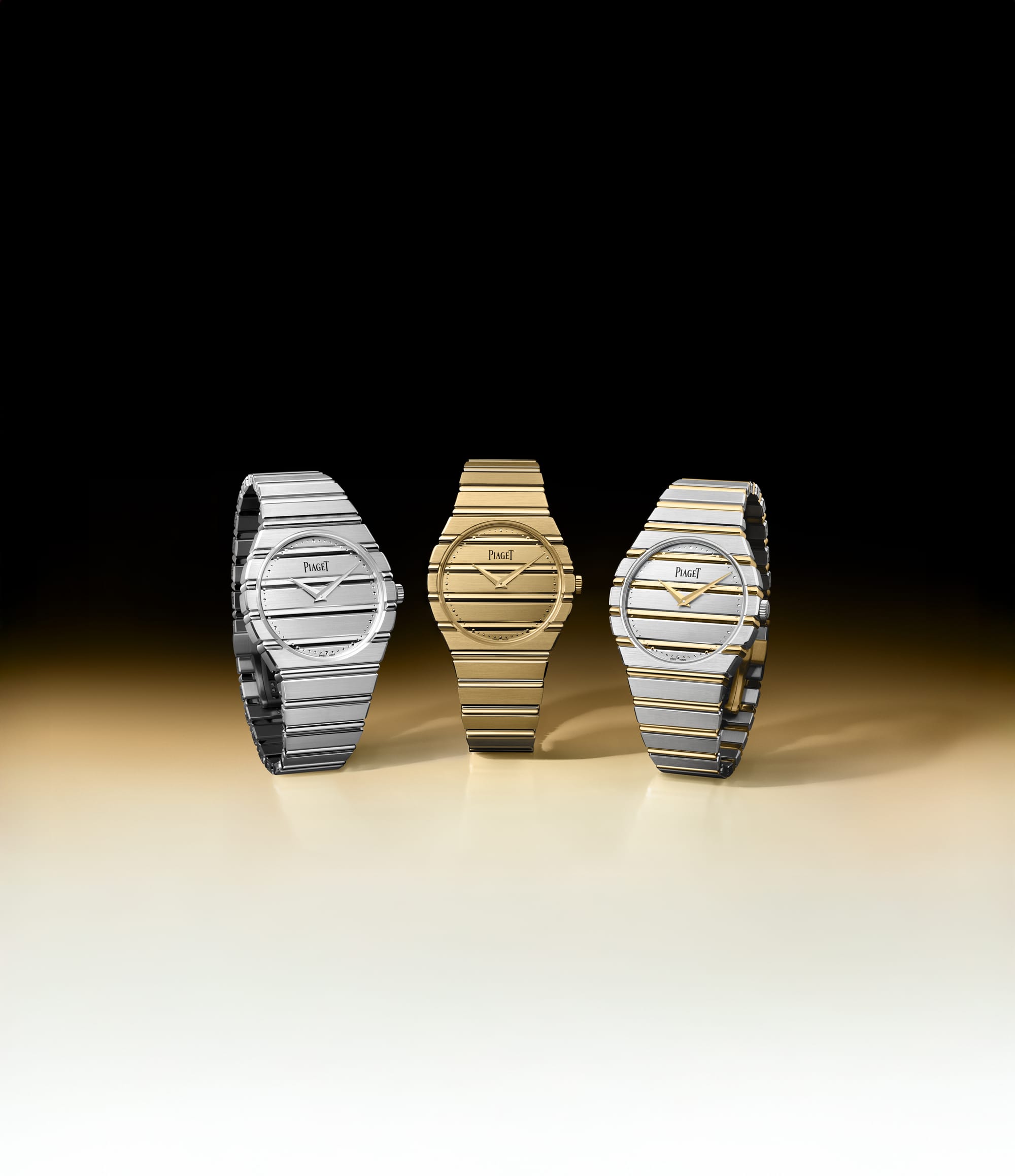
The Piaget Polo 79 has already lived a few lives in its return. First in full yellow gold, closely echoing the original and leaning into the excess Piaget was comfortable with at the end of the ’70s.
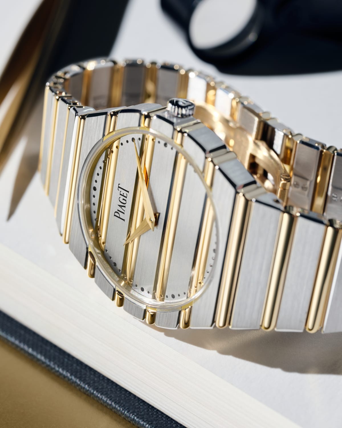
Then in white gold, quieter and more restrained, the version that made sense if you liked the idea of the Polo but weren’t ready to commit to that much shine. The new two-tone sits between those two moments, and it feels less like a statement than a settling point.
That’s largely because the Polo has never been a watch built around a single, fixed expression. When it debuted in 1979, Piaget wasn’t trying to solve the same problem as the steel sports watches that would come to define the category. This was a precious object from the start, designed around horizontal gadroons that ran across the dial, case, and bracelet, blurring the line between watch and jewelry.
The Polo was meant to be worn socially, recognized instantly, and understood as part of a lifestyle rather than a performance narrative. That framing still explains why the design holds up, and why shifts like this one don’t feel disruptive.
In vintage circles, it’s one of those watches design-sensitive collectors have quietly held onto, not because it’s rare in a traditional grail sense, but because it occupies a lane very few watches ever really did. The integrated bracelet reads more like a piece of goldwork than sports hardware, the proportions stay elegant even decades later, and the overall effect feels closer to jewelry than instrumentation.
That’s why it shows up in places you might not expect. A$AP Rocky, for instance, has a tiny vintage Polo in his rotation, worn the same way he approaches jewelry, deliberately, almost offhand, as part of a broader visual language rather than a statement piece.
The two-tone Polo 79 works because it stays true to how the watch has always been built. This isn’t the familiar mix of steel and gold that turns up in so many bi-color watches, where contrast is the point. Both tones here are precious metals, and that changes how the design reads. White gold forms the base of the case, bracelet, and dial, while polished yellow-gold gadroons cut across those surfaces in the same horizontal rhythm the Polo has used since 1979.
Light moves differently across the watch, the pattern becomes more apparent on the wrist, and the stripes that define the Polo stop feeling decorative and start feeling structural.
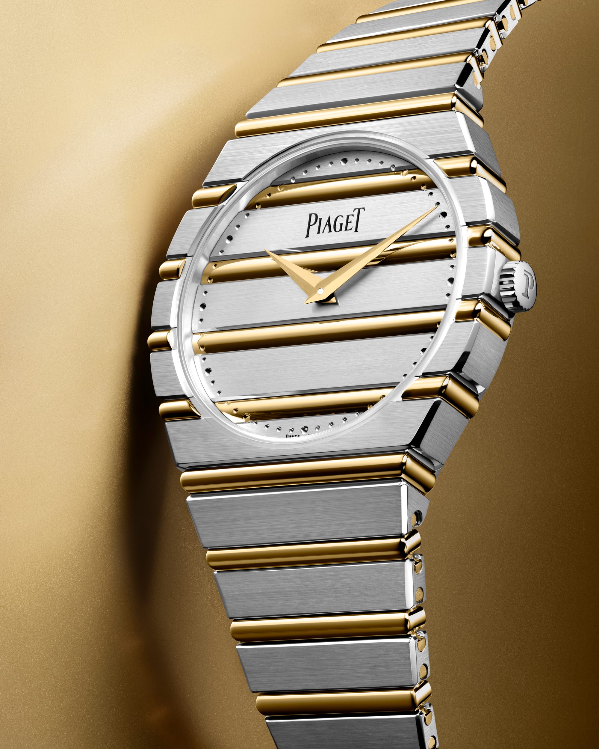
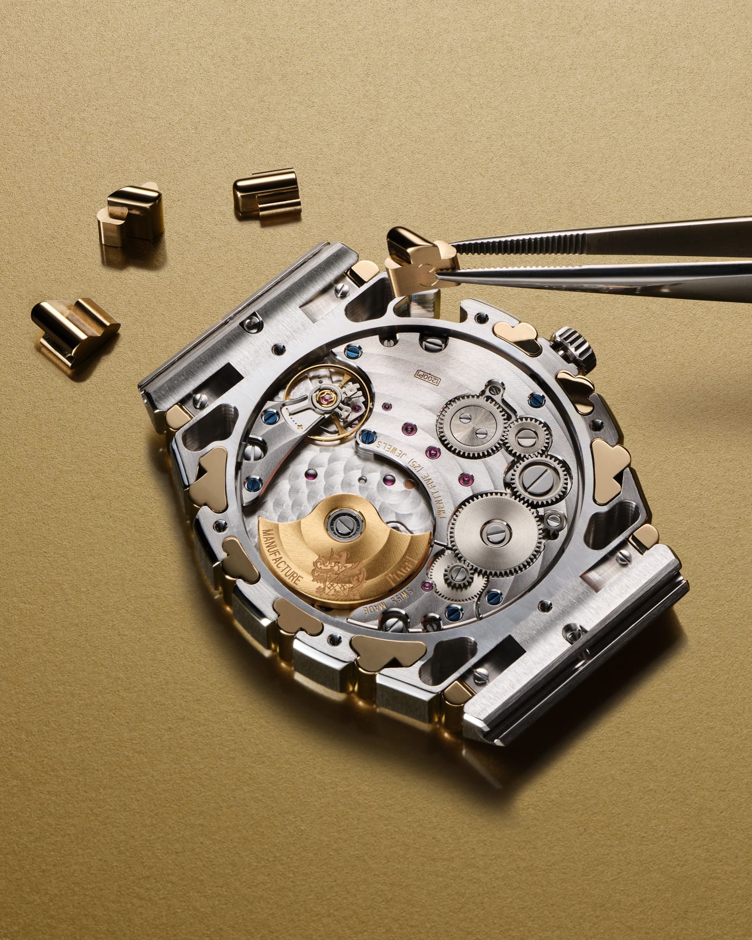
That same thinking carries through to the movement. The original Polo famously ran on quartz, which made sense for a jewelry-forward watch of its era. The modern Polo 79 is powered by Piaget’s ultra-thin 1200P1 automatic movement, a micro-rotor calibre just 2.35mm thick.
It keeps the watch slim at 7.45mm overall and preserves the way the Polo wears, adding a mechanical movement without changing how the watch feels on the wrist. At 38mm in diameter and roughly 200 grams in solid gold, it still reads first as something you experience, not something you measure.
Taken together, the two-tone Polo 79 feels less like a reinvention and more like Piaget easing back into a rhythm it never really lost. After years of steel sports watches setting the tone, there’s room again for watches that behave like objects, that register as part of an outfit rather than equipment.
That’s where the Polo has always made sense. It isn’t interested in competing on toughness or technical bravado. It works because it understands proportion, surface, and repetition, and because it’s comfortable letting gold be gold. The two-tone version doesn’t try to modernize the Polo or dress it up as something else. It simply leans into the idea that identity doesn’t have to be fixed to stay recognizable.
In that way, the Polo 79 changing its stripes isn’t really a change at all. It’s Piaget continuing to do what it’s always done well, trusting the design to carry itself, and trusting the people drawn to it to understand why.